1 From Dashboard to Decision-Maker
OpsPilot — Impact Mapping Who Actually Has to Change
· 6 min read
Product OpsPilot Strategy
You're reading Part 2 of 3 in the OpsPilot series.
Use the Series Navigation button at the top-right to browse all posts in the series.
Start from the beginning →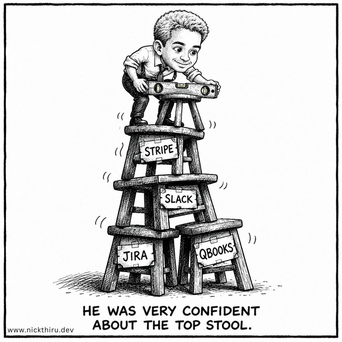
The User Moment
I had a product vision doc for OpsPilot sitting open on one monitor and an empty file called impact-map.md on the other. The vision doc was full of good instincts: unify Slack, GitHub, Jira, QuickBooks, and Stripe into one operational view for small-business founders drowning in tab-switching. It described the dashboard, the integrations, the eventual pricing tiers. What it didn’t have was a single sentence about whose behavior actually needed to change for any of that to matter.
Picture the actual user: a solo founder who opens QuickBooks, then Stripe, then Slack, then Jira, every single morning, out of habit, before they’ve even decided what they need to act on that day. That ritual is the friction OpsPilot exists to remove. But removing a ritual someone’s built their whole morning around is a much harder design problem than “build a dashboard that shows the same data in one place.” The data being visible somewhere new doesn’t mean the founder stops checking the old places. I needed to understand that gap before I designed anything.
The Design Problem
The hard part wasn’t deciding what data to surface. It was figuring out what would actually make someone trust a summary enough to stop checking the source. Those are different design problems, and the vision doc had only really engaged with the first one.
If I designed straight from the feature list, I’d end up with a technically complete dashboard that solved the visibility problem and left the trust problem untouched. And trust is the actual blocker: a founder who’s spent months treating QuickBooks and Stripe as ground truth isn’t going to hand that role to a new summary screen just because it exists. Designing for that meant starting from the founder’s specific moment of decision, not from the list of tools being unified.
There was a second problem tangled into the first. OpsPilot doesn’t own any of the data it displays. Every insight about invoices, usage, or support tickets comes from someone else’s API. That’s not just a backend detail, it’s a design constraint: the summary can only be as trustworthy as its least reliable upstream source, and if I designed the interface as though that data were as stable and owned as, say, a database I controlled, I’d be building a UI that overpromises. Naming that constraint early meant the design had to account for uncertainty, not paper over it.
The Options
I considered just designing the dashboard from the vision doc’s feature list. It was tempting. The list already felt like enough thinking, and momentum is its own kind of validation when you’re building alone. But a feature list tells you what to build, not what problem you’re solving for the user opening the app at 7 a.m. I decided that wasn’t good enough as a starting point.
So I worked backward from the biggest goal, reducing time spent on manual admin, and forced myself through three questions before allowing any feature onto the page: who has to behave differently, what does that new behavior actually look like, and only then, what capability would make it possible. I refused to skip ahead to capability.
That ordering changed what came out. When I let myself jump to capability first, I kept describing dashboard widgets: charts, tabs, a notifications panel. When I forced myself to describe the actor and the behavior change first, the design options that emerged were sharper and less flashy. “Unified operational dashboard” is a widget list. “Founder scans one summary before deciding what to act on, instead of opening four tools” is a behavior a design either supports or doesn’t. Only the second framing let me evaluate design options against something real.
The other option on the table was to treat the API-dependency constraint as an engineering concern to handle later, and design the interface as if the data behind it were fully reliable. I considered this seriously, since it would have let me move faster on the visual design. I rejected it because a summary screen that quietly assumes perfect upstream reliability is a design that will eventually mislead the person using it, and that felt like the wrong trade to make even in an early version.
The Build
What I actually built, in this pass, wasn’t code. It was a one-page impact map: one row per business goal, and for each goal, the specific actor whose behavior has to change, the concrete before-and-after of that behavior, and the single biggest constraint standing between the current behavior and the new one. No feature names allowed until every row had all three filled in.
For the operational-admin goal, the actor is the solo founder currently checking four or five tools by hand. The behavior change is replacing that manual check-in with one daily glance at a single summary. And the constraint I flagged as highest-risk is that the summary’s trustworthiness is capped by the reliability of the third-party platforms it depends on. If Stripe or QuickBooks tightened API access or changed what’s available, the “unified view” stops being unified regardless of how well the interface is designed.
I didn’t solve that constraint in this pass. Naming it clearly, as a design constraint rather than a footnote, was the actual output. It now shapes what I’m building first: I’m prioritizing visible confidence indicators and graceful degradation states in the summary UI, because the design has to be honest about data reliability from day one, not add that honesty later as a patch.
The Verdict
Does the impact map solve the design problem? Partially, and I think that’s the honest answer. It doesn’t tell me exactly what the summary screen looks like yet. What it does is stop me from designing a screen that assumes trust it hasn’t earned, and it gave me a concrete behavior to design toward: the founder scanning one summary instead of opening four tools. That’s a testable target in a way “unified dashboard” never was.
It also exposed a real limitation in my own process: I only let myself surface one constraint per goal, which kept the impact map usable but means there are other risks sitting in the source material that this exercise didn’t force to the surface. I’m treating that as a known gap rather than a solved problem, and it’s the first thing I’ll revisit before the design phase produces actual screens.
Your Turn
If you’re mid-design on something right now, try this before you sketch a single screen: name the exact moment your user is in when they’d reach for your product, and the specific thing they’d need to stop doing for it to be worth switching. If your design doesn’t hold up against that moment, you might be designing a feature, not a solution.
Have thoughts on this? I'd love to hear them. The conversation is happening on:
Now Building
OpsPilot
SMBs will be able to run their entire business with the operational efficiency and intelligence previously available only to enterprises with dedicated accounting, finance, customer support, sales & marketing, and operations teams.
Learn more and join the waitlist